ReversingCancer.org
The current system of cancer research has failed us. It's time we begin funding the "renegade" blue-chip scientists whose research shows real promise.
Learn More
Outcomes from Cancer stages 3 and 4 are little better now than they were in 1930.
The current system of cancer treatment has failed us.
The most promising avenues for curing cancer are not being funded… and the same old failed slash, poison and burn techniques continue to rake in billions. Leukemia patients receive the exact same medications they were getting in 1977.
Most people assume cancer treatments are advancing just like other technologies like smart phones and self-driving cars. This is not the case. Knowledge is advancing and papers are being published but patient outcomes in Stage 3 and 4 are little better now than they were in 1930.
Focus should be on the strategic differences offered by renegade blue-chip scientists and their prospective breakthroughs… NOT creating a new drug that makes billions while extending the life of a patient by a few weeks or months.
Donate Now
1
CANCER IS
cells evolving out of control.
2
CANCER CELLS ARE
smarter than any doctor or medication.
3
CANCER IS
a disease of cellular identity.
When cells go rogue… when they defect... they activate their evolutionary machinery. Cancer cells capitalize on aspects of evolution that are almost never talked about.
More than 10,000 scientific papers prove your immune system is smart – it actively adapts to an infinite range of threats, in real-time.
Bacteria develop resistance to antibiotics with intelligence.
Viruses interact with hosts — active communication
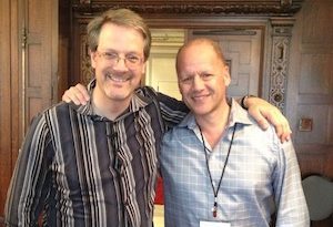
Perry Marshall (L) with friend and valuable business advisor Rob Berkley (R), taken by cancer, Dec 2019.
All it takes to switch smart cancer into hyperdrive is to start chemo.
Chemo kills 75%, maybe even 99% of the tumor cells. (It kills healthy cells too, but that’s a different story.)
Sadly, the 25% or 1% the chemo doesn’t kill are smart. One species of cancer evolves into 1,000 species in weeks, each acquiring unique new tools and defenses…
- Tumors have goals and evolve purposefully.
- Cancers have goals and evolve purposefully.
“Cancer treatment is currently working to prolong the disease. It does not kill the disease, nor even prevent the disease from forming.”
Dr. Azra Raza
Physician, Scientist, AuthorCancer is smarter than oncologists. We’ve been underestimating nature’s resourcefulness for a century. Why is that?
For a century now, doctors, scientists, and oncologists have been taught that evolution is random, accidental, purposeless, has no plans or goals. In the 1940’s, evolutionary biologists pronounced evolution to be blind, lacking intent. ‘Nothing but chance and selection.’ This was drilled into students’ heads from high school on.
Even when one of these scientists discovers otherwise, daring to acknowledge that life is smart is forbidden – has ended careers.
If you can’t admit tumors are smarter than we are, how can you stop cancer?
Blaming the cancer profession for squandering $250 billion of tax money and $90 billion in donations is easy.
It’s easy to fear that a cure exists, but kept secret - so billions in medical profits will continue. If you believe that, as do so many... do you also think wealthy geniuses like Steve Jobs and David Bowie were somehow denied access to a cure?
It’s NOT the individuals inside the system – it’s the system itself that continues to lose “the war on cancer.” By focusing on wrong priorities.
The money chases the ever-seductive mirage. The next mutation… oncogene… the next genomic analysis… metabolic pathway… will contain the answer. “One of these days all those pink ribbons and 5K runs will pay off.”
“They’ve done like forty years of research, ninety billion in donations We’ve been running for the cure and wearing ribbons for ages. Why are people still goin’ through radiations? Crazy.”
Tom MacDonald, “Cancer”
(https://youtu.be/WQnYq5Q-4D8)
(https://youtu.be/WQnYq5Q-4D8)
Everybody wants the hack… the drug… the magic silver bullet that cures all cancer.
How can there be a single fix when cancer itself is a living cell that is capable of innovating in any situation imaginable?
The money is chasing an elusive mirage.
It’s NOT the individuals inside the system – it’s the system itself that continues to lose “the war on cancer”, by focusing on the wrong aspects.
Donate Now
Here’s what we’re doing about it…
Building from our 2020 Cancer & Evolution Symposium, we are funding the researchers who are detecting cancer at Stage Negative 1 and reversing cancer in real time. We are funding projects that do not fit the standard models. Our criteria for funding projects is the following five guidelines:
1
We don’t fund Big Pharma drugs. Everyone else is doing that anyway and it’s not working.
2
Jettison Evolution 1.0 (“evolution is blind”) and replace it with Evolution 2.0. Welcome to the age of the smart cell.
3
Our Gold standard is engineering, not peer review: We fund what works. Not what is fashionable or 'in vogue.'
4
We fund research that government and traditional charities won’t fund because it threatens the status quo. The current system is built around very powerful assumptions that are wrong; a cure will never come from that system.
5
We fund skin-in the game researchers who made personal sacrifices. Each of our researchers creatively funded their work at various points because they had unshakeable conviction that it was right, even though it was unpopular or bucked the trends.
Dear reader, do YOU want to reverse cancer?
Donate Now
Will you keep telling yourself everything’s okay?
The current system for curing cancer will NEVER work
The next time you get that phone call “I just got diagnosed with cancer”
...Will you keep telling yourself everything’s okay?
Will you look down at your shoes and think, “Thank goodness it’s them and not me”?
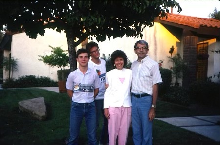
Upon learning of his terminal cancer diagnosis, Pastor Bob’s congregation donated a 5-week tour of every state west of Nebraska, including AK and HI. (L-R) Bryan, Perry, Betty, and Bob Marshall.
Or... will you right now donate towards real research that is working?
The next time your relative, friend or colleague drops the “C” word, you’ll already be well ahead of the present quagmire. You'll already be doing your part to shift cancer care into a new reality.
All donations gratefully accepted
Contact us with any questions